


Art in America
December 2011
Click here for web link

Presence Past and Reverie Future: Thoughts on Recent Abstract Painting
Posted on 05 October 2011
www.squarecylinder.com
The anonymous sign read “Pretty Pictures Never Solved a Problem,” and it would be fair to suppose it was intended as some kind of critique of esthetics in the name of ethics. But to that sign, I still wanted to add “they never pretended to do so, either,” so that I could make the point that a disinterest in ethics is still ethically superior to pretending to be concerned about ethics in the name of personal or interest-group self-aggrandizement. During the past decade of political and financial tumult, we have seen a lot of art engaged in such pretenses, be it labeled “institutional critique,” “social-practices,” or the ever- popular “relational esthetics,” all of which in their own way tried to feel the world’s pain as a prelude to exaggerating their own claims of importance in the greater scheme of things. Good thing the Wall Street protestors didn’t get bogged down in any of these art world conceits, lest they, too, fall victim to being programmatically ineffectual.
Now the stage is set for the claim that this article seeks to make, which is that there seems to be some new energy percolating in the much-maligned world of “pretty pictures,” that is, abstract painting called by that other unfairly dismissive names. Of course, anyone with any sustained involvement in the art world can tell you that abstract painting goes through some kind of revival every decade, meaning that you could have set your watch to the predictable arrival of the recent crop. But this time around, things seem a little bit different. What seems to be taking place seems less a predictable revival of a well-known style (such as the late 1990s “Post-Hypnotic Abstraction” revival of late 1960s Op Art), and more a deep rethinking of the whole historical enterprise of abstract painting. This seems particularly remarkable if you have been paying close attention to the past two decades of technologically-assisted confusion about the relationship of art and entertainment because we were all beginning to assume that the possibility for such thinking was being diluted out of existence.
Pamela Jorden's recent exhibition at Romer/Young (through October 15) represents one such instance of deep rethinking. Her work tends to be rather small, but it provides visual experiences that are very rich, complex and full of nuance. Most of her paintings are formatted as circular compositions or as almost perfect squares, offering an intimate visual experience that balances subtle fantasies of soft, fluid shapes with other more graphic forms that are circumscribed by torqued edges that are crisp and decisive. A rich palette of shadowy hues predominates the more fluid areas of her work, which include the addition of reflective materials that add iridescence to subtle shifts of tonality. Jorden’s improbable variety of painterly treatments appears to be a mélange of choreographic diagrams.
Jorden’s work is also very allusive and multi-layered, and if your art-historical antennae is rusty, you might miss her many evocations of artists such as Redon and Kandinsky and Schwitters, whom she casts in some very imaginative relations to the way that abstract painting evolved between the poles of Dada and Constructivism during the two decades separating the end WWI and the beginning of WW II. All of this now seems ripe for a second look, because we have routinely regarded the highly complex art history of those two decades through Alfred Barr and Clement Greenberg’s ideas about the “inevitable” evolution of Modernist Art. But instead of sharing those critic’s assumptions about the inevitable historical march to the promised land of visual purity, why not see the esthetic vocabularies hatched during those two decades as the early exploration of elaborate possibilities? Here is where Jorden’s work seems to have hit on something. It simultaneously reaches back to abstraction’s deep historical roots in Symbolism while also reaching forward to a world of unconventional variation on the themes of pictorial innovation for the sheer sake of exploration.
The notion of reaching back to the Symbolist roots of Modernist abstraction while simultaneously reaching forward to is also evident in Jamie Brunson’s exhibition at the Triton Museum (through November 20). Titled Indra’s Net, the show calls attention to Brunson’s longstanding involvement with kundalini meditation pratices, a theme born out born out by all of the 22 works on display. These parse out into three separate groups, one being a group of concentrically symmetrical compositions that like seem like schematic, non-referential versions of Tibetan Mandalas, another that spreads vertical streaks of bright color more-or-less evenly across spacious and sumptuous picture surfaces, and a third that seems like a hybrid of the other two. I would call the works in this third group “cellular distribution images,” but that might be a bit overdone. Their characteristic, irregular grids, look a bit like close-up examinations of reptile scales, except that the delicate surfaces of these works are anything but tough and lizard-like.
In fact, the almost gossamer surfaces of Brunson’s works are among their most remarkable attributes. Brunson paints on a taut polyester fabric rather than conventional canvas, to which she applies oil paint that is suffused with both alkyd and wax medium, giving the surfaces of her works a radiant luster that seems a bit futuristic, but is nonetheless perfect for her color choices, revolving as they do around an exuberant chromaticism that only rarely flirts with being sugary. More often, they reveal a subtle sense of modulation, and in fact, when your eye adjusts to the work you often see subtle shifts that coalesce into almost invisible forms that echo the more pronounced interweaving of graphic shapes.
Given that Brunson’s exhibition is taking place in a Silicon Valley museum, it is not too much of a stretch to read the lattice structures of her “cellular distribution images” as schematic representations of complex, multi-nodal communications networks, but I might want to go even further to suggest that they prompt the viewer into a reconsideration of the question of where the center of a pictorial experience might reside, not to mention another question: why should art continue to assume the need for such centers?
Zheng Chongbin is another abstract painter whose work ponders a similar issue from a very different point of view that is deeply rooted in the history of Asian painting. I am still haunted by Chongbin’s exhibition at Haines Gallery last winter, partly because it succeeded in doing what so many artists have tried and failed to do, that is, create a true and deeply resonant synthesis of Asian painting with a sophisticated grasp of the modern western notion of “the picture object,” that being Michel Foucault’s term of approbation for the tradition in painting that begins with the work of Eduard Manet.
Chongbin applies different consistencies of black ink on to sheets of Xuam paper (made from sandalwood fiber), which for over a thousand years have been the preferred painting surfaces for calligraphic ink painting owing to the way that they reveal both the flow and crispness of an artist’s brushwork. As was the case with the master painters of the Sung and Yuan dynasties, Chongbin’s brushwork changes tempo to create an elegant choreography of shapes that bespeak what ancient scholars referred to as “landscapes of the mind.”
His flowing forms obliquely allude to distant landscapes shrouded in evanescent atmospherics, and they invite the viewer’s imagination to wander into and through them. But his surfaces also bespeak a phosphorescent marbling effect created by the judicious application of white acrylic paint that brings the viewer’s gaze back to the facture of the work’s surface. This oscillation between material fact and lyrical allusiveness is the formal basis for Chongbin’s work, which plays out in the viewer’s imagination through an elegant undulation of forms that allow the eye to travel from zones defined by a rich saturation of black ink to others that give way to free-flowing, mid-tone forms. These provide a contemporary echo of the way that Sung dynasty masters portrayed the Yangtse river gorge, only in Chongbin’s work, there is almost no evidence of geological fact. Instead, we see an emphasis on the revelation of rhythmic geomantic energies that ancient Chinese philosophers claimed were at the core of all natural beings.
The works of these three artists – Jorden, Brunson and Chongbin — are among a plentitude of similar efforts that I have noticed during the past year. Other artists whose work I would also include in my list of interesting new abstraction would include Corinne Wasmuht's stand-out contribution to this past summer’s Venice Biennial, and the work of Michael Wingo, a Los Angeles painter whose recent solo exhibition at Gallery KM in Santa Monica was a welcome treat. I think that it might be interesting to note how much of the new abstraction that I am seeing harks back to the late, post-1973 works by Elmer Bischoff, Jay DeFeo and (a little bit later) Frank Lobdell, who at that time all took a decisive turn toward the abstract right when most of the painting world had started its move toward post-modernist figuration.
–MARK VAN PROYEN
About the Author
Mark Van Proyen is Chair of the Painting Department of the San Francisco Art Institute. He is a corresponding editor for Art in America, and his critical writings have appeared in many publications, including Art Criticism, Artweek and Art Issues. He is currently working on a novel titled Theda’s Island, the story of which is set in the art world.
Pamela Jorden: “Looking Through Trees” @ Romer Young through Oct. 15, 2011
Jamie Brunson: “Indra’s Net” @ Triton Museum through Nov. 20, 2011
Zheng Chongbin photos courtesy of the artist and Haines Gallery.


Quarry, 2011; acrylic and bleach on fabric; 33 x 33 in.
Courtesy the Artist and Romer Young Gallery, San Francisco.
Looking Through Trees
PAMELA JORDEN
SEP 16 - OCT 15
by Zachary Royer Scholz
Looking Through Trees, Pamela Jorden’s first solo exhibition with Romer Young Gallery, presents a group of paintings whose subtle complexity requires prolonged and ideally repeated viewing.
The majority of the paintings exhibited showcase the characteristic style that Jorden has crystallized over the last few years. In such works as Fragments of blue dense (2011) and Quarry (2011), Jorden uses angular streaks and arching sweeps of paint to create dense, tangled webs, whose fractal energy not only bursts, but also quietly shimmers. Painted on darkly dyed canvas, these pieces are ingeniously anchored by bleach under-painting. The resulting batik-like marks inform the placement of Jorden’s overlaying brushwork and provide some of the paintings’ most poetic moments. Jorden’s palette centers on a bruise-like mix of blues, purples, and blacks, but she deftly orchestrates these otherwise somber hues to produce tones that are tranquil rather than dour—more like open expanses of night sky than funereal shrouds.
Diverging from the main group of works are two symmetrically structured paintings, entitled Smoke and Vega (both 2011). Their geometric stability nicely balances the amorphous energy present in Jorden’s other paintings and creates a dialogue that expands the show’s otherwise tight boundaries. In these paintings, as in her signature style, Jorden’s playfully angular brushwork retains much of drawing’s immediacy, while simultaneously exploiting paint’s viscose potential. Triangular edges fade and bounce into one another, creating shifting relationships that evade fixed comprehension. Jorden’s nuanced compositions rub against each other, causing energy to pool in these works until it leaks into the gallery space and contrasting nicely with the way her other paintings seem to recede infinitely.
Considered in relation to one another, the paintings in Looking Through Trees make it clear that Jorden’s title is metaphorical if not philosophical. While the fragmentary forms in some of the works could be seen as abstract foliage, they more accurately embody mediated perception. Like flickering light passing through leaves, Jorden’s paintings present a subjective and perpetually moving target. They create fleeting perceptions that elude memory but leave ghostly traces in their wake.
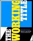

The Working Title
Exhibition Catalog
The Working Title - Progress Report
Bronx River Arts Center
March 25 - April 29, 2011
A 32-artist group survey of recent abstraction organized by Progress Report
A 92-page full color catalog of the show with essays by artist Shirley Kaneda and independent curator Jon Lutz is now available on Blurb.
www.blurb.com/bookstore/detail/2120276
HOW IS YOUR WORK INFLUENCED BY ART HISTORY? IS IT MORE IMPORTANT FOR YOU TO EXTEND PREVIOUS CONVERSATIONS OR ATTEMPT TO INVENT NEW ONES?
My work is influenced by the continuum of my experience. I stand in front of a Philip Guston and consider a painting made at a particular moment, its context in the museum and what I know of the artist and his politics. At the same time, I revel in the visual, tactile, and visceral experience of looking at the painting. This experience connects the past with my present. I imagine myself involved in many conversations as my paintings run alongside the work that inspires me, tumbling around with expressionism and geometry, chasing off after what surprises and confounds me.
IN MAKING WORK, TO WHAT DEGREE IS YOUR DECISION MAKING PROCESS INTUITIVE VS. DELIBERATE? IS THERE A COMPETITION AND/OR STRUGGLE BETWEEN THE TWO?
My paintings often begin with a simple idea or proposition. For example, what happens if diagonal lines are scraped into a washy gray ground? Painting for me is an experiment in which marks and color have weight and energy with the power to harmonize or disrupt. My process is one of creating problems as much as solving them. Intuitive vs. deliberate? These impulses are not at odds for me, they operate in tandem; action/reaction as the painting takes form.

http://www.artcritical.com
Variety Trumps Argument at the Bronx River Art Center
By Stephen Maine
April 23, 2011
The Working Title, Organized by Progress Report, at the Bronx River Art Center
March 25 to April 29, 2011
305 East 140th Street #1A
Bronx, NY.
Devise a cohesive fiction, or report the scattershot facts? The nature and purpose of curation is an issue in “The Working Title,” a lively but unfocused exhibition of 32 abstract artists, mostly painters, on view at the Bronx River Art Center through April 29. The show is assembled by Progress Report, the online and curatorial project of Vince Contarino and Kris Chatterson, who opt for fidelity to abstraction’s currently schizophrenic condition rather than identify and analyze a dominant personality. According to the show’s press release, the curators eschew artists who adhere to “the doctrine of romantic sentimentality” — an oxymoron if ever there was one. Otherwise, the connective tissue is stretched thin.
The show is engaging nevertheless, as it includes fine work by both recognized and undersung talents. An inventive and resourceful colorist, Pamela Jorden contributes the shadowy but buoyant Echo Music (2010) in which brushy patches and smears of lugubrious near-blacks and rumbling, pungent blues underscore a dazzling range of scraped, glazed, silver-tinted grays. Jordan does not conceal her pleasure in finding her way forward toward the painting’s resolution, guided by impulse, taste and faith in her pictorial proclivities. If her sensibility isn’t romantic, then it’s very close.
Matthew Deleget’s work resides toward the other end of abstraction’s spectrum as the realization, on a painted surface, of a preconceived procedural idea. The colors in Shuffle (for Grandmaster Flash) (2011) are selected at random—yellow, pink, fluorescent orange and copper predominate—and arranged by means of a predetermined system of recombination within a four-by-four unit grid. Abstraction as perceptual research, Shuffle is an extreme instance of the empirical attitude that underlies much of the work in the show, which is alert to pictorial strategies rather than intent on fetishizing subjectivities.
A sense of architectonic scale arises from interpenetrating rectangles and triangles in black, red, and two variants of yellow in Untitled (very tizdayle) (2009) by Tisch Abelow. Abelow’s handling is flat and graphic but the painting’s space craftily shakes itself loose from rigid geometry to suggest a modernist façade, a cantilevered balcony, a sun-washed portico, or an edifice in the middle distance. Nearby is Joy Curtis’s towering, chalk-white St. Virga (2010), a work in hydrocal, fiberglas, wood and metal in which cast fragments of fluted pilasters dangle like an ungrounded pillar, contacting neither ceiling nor floor and implying havoc and destruction—or at best, impermanence. The piece recalls the work of Lynda Benglis in its precise equivalence of process and image.
In fact, all the three-dimensional works in “The Working Title” relate at least as strongly to pictorial space as they do to physical space. Resolutely planar, Inna Babaeva’s More Than You Think (2011) consists of a half-dozen painting stretchers of various dimensions, hinged together in a free-standing accordion fold and strapped with translucent colored plastic. Letha Wilson weighs in with the peculiar but compelling Double Dip (2009), two thin strips of plywood bent into teardrop shapes, pinned to the wall by their pointy ends, and lined on their inner surfaces with photographs of verdant woodland. A punch line among colors gets a little respect in Stacy Fisher’s Fuchsia Sculpture With Wood (2010) in which a squarish blob roughly brushed with the flamboyant hue is lodged between blocks of lumber stained a plain-Jane brown. Pushing and pulling space even as it hugs the wall, the piece functions like a painting.
That undercurrent of humor is sustained throughout the show. E. J. Hauser’s spaceman (2010) inscribes a discombobulated argyle pattern in red-orange and whiteon a blue-black shape that reads instantly as the helmeted head of a spaceman—or motorcycle daredevil, or linebacker. Echo Helmet (2010) by Britton Tolliver reprises the domed shape, inverted and approximately mirroring itself, via juicy slabs of waxy-looking paint in quietly radiant tones. While the motif of protective headgear is completely appropriate to such a cerebral exhibition, the presence of all this recognizable imagery prompts the question of how the curators define abstraction. They dodge that task, as (from the press release again) these artists may merely “use abstraction as a starting point.” Ah.
What is clear is Progress Report’s skepticism of the high seriousness with which abstract painters of fifty years ago regarded the existential confrontation with the void of the blank canvas—as nothing less than a search for the self. Oh, well. Now that the self is swept up and bounced around in a proliferating matrix of provisional, contingent relationships, it has no fixity and the effort to locate it is a fool’s errand.
Among the show’s other standouts are Keltie Ferris’s Black Power (2010) with its jazzy, nested chevrons and fizzy spots festooning a meandering rectilinear polygon the color of dirt; Cordy Ryman’s Vector (2010), a studiously clunky low relief of two-by-fours painted serene green-blues (half-hidden, hot orange flare-ups provide chromatic sizzle) gouged with six intersecting grooves that radiate like the spokes of a wheel and allude to the face of a clock; and Dennis Hollingsworth’s maniacally overwrought Todo es Igual (2011) in which—and on which—paint is coaxed into bloom as in a hothouse. Rather than advancing an argument regarding the thrust of contemporary abstraction, “The Working Title” replicates its variety. But with friends like these, who needs curators?
Interview with Mario Vasquez
http://mariosartworld.blogspot.com/2010/04/interview-with-pamela-jordan-artist-and.html
**Click here for full interview
